
Forum Index • FAQ • Login
Psybucks • phpBB FAQ • Psypoke Forums FAQ • Forum Rules • Psypoke Staff


 ~
~
|
It is currently Thu May 23, 2024 8:33 am |
|
All times are UTC - 8 hours [ DST ] |
|
|
Page 5 of 5 |
[ 124 posts ] | Go to page Previous 1, 2, 3, 4, 5 |
| Print view | Previous topic | Next topic |
D's manifistaions - CLICK ON ME NOW!!!...please
| Author | Message |
|---|---|
|
Pokemon Master   Joined: Tue Jun 19, 2007 11:24 am Posts: 1152 Location: IN THE EMOTIONLESS TRAWLING FERVOR'S OF MY INSANE MIND. |
Pillow wrote: dude, this stuff is cool!
hey, just for kicks, could you do two mewtwo's, with a ghostly purple backround, and text saying 'attack of the clones'? or, i could pay you or whatever. whatever anyone else pays you, thats cool. oh, yeah: i liked the weezing 'smoking kills'. could i use that? Puz this kinda stuff in shop pleaz. Yes you can use smoking kills. SorcererDNA wrote: In order of judging those 4:
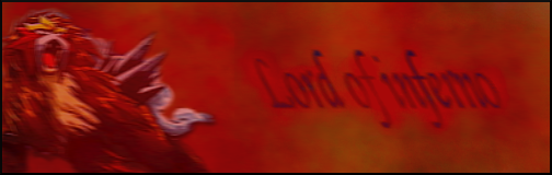
#1, Flame of Darkness: Nice going there. Looks fine to me. #2, You shan't rid your soul of I: Don't you mean, 'You shan't rid your soul of me? Anyway, like this one too. #3 and #4: Yuck. Not 4 so much as 3. 3 makes my eyes hurt; I can't even tell what it is. And Mewtwo doesn't really need red eyes there. - DNA Again, all this stuff was specifically asked for by custuemors. I would never have willingly made 3. Red eyes where requested, specifically "you shan't rid your soul of I" was requested. And Mewtwo really did need red eyes, In the original sprite with him putting his hand like that and such, his eyes where closed. Thanks for commenting _________________   ^DarkCosmos, Poems^ |
| Wed Aug 29, 2007 5:33 am |
|
|
Pokemon Master Joined: Tue Jun 19, 2007 11:24 am Posts: 1152 Location: IN THE EMOTIONLESS TRAWLING FERVOR'S OF MY INSANE MIND. |
Hey looky! I FAILED

Resize 
Recolor+resize ....Please post _________________ ^DarkCosmos, Poems^ |
| Thu Aug 30, 2007 8:21 pm |
|
|
Ace Trainer   Joined: Mon May 14, 2007 3:43 am Posts: 396 Location: UK |
I am pretty sure you aren't meant to request 'fails at life' special ranks... but if they don't mind then whatever
It isn't exactly difficult to do... and the sig version really makes you squint Flame o' Darkness Good, nice background Spiritomb... needs a border I think (or even better would be if the tendrils branched out and ended...) also a bit plain... Your next... should be you're next The red eye on the mewtwo is badly done _________________ Yes, I used to have a shop; no, I'm not still doing it. (Unless you can give me a good reason...) |
| Fri Aug 31, 2007 2:28 am |
|
|
Pokemon Master Joined: Tue Jun 19, 2007 11:24 am Posts: 1152 Location: IN THE EMOTIONLESS TRAWLING FERVOR'S OF MY INSANE MIND. |
Joey90 wrote: I am pretty sure you aren't meant to request 'fails at life' special ranks... but if they don't mind then whatever Your next... should be you're next I agree with that ^ completely. Again, this was requested. I didn't request the rank, I made the avatar. _________________ ^DarkCosmos, Poems^ |
| Fri Aug 31, 2007 7:27 am |
|
|
Pokemon Master Joined: Tue Jun 19, 2007 11:24 am Posts: 1152 Location: IN THE EMOTIONLESS TRAWLING FERVOR'S OF MY INSANE MIND. |
Well, it's been a while. Here's some more stuff I made:


^now this was a bad resizeing Please comment! _________________ ^DarkCosmos, Poems^ Last edited by dunsparce on Sun Sep 30, 2007 6:40 am, edited 1 time in total. |
| Wed Sep 05, 2007 1:22 pm |
|
|
Bug Catcher   Joined: Sun Sep 09, 2007 4:40 am Posts: 22 Location: Over there |
dunsparce wrote: Thanks.
I was bored so I made this: 
Any suggestions for text? Parallel Universe |
| Wed Sep 12, 2007 6:36 am |
|
|
Pokemon Master Joined: Tue Jun 19, 2007 11:24 am Posts: 1152 Location: IN THE EMOTIONLESS TRAWLING FERVOR'S OF MY INSANE MIND. |
MAJOR UPLOAD!!!! SO MUCH SPAWNING!!! AHHHHH!!!


(only one done for fun) 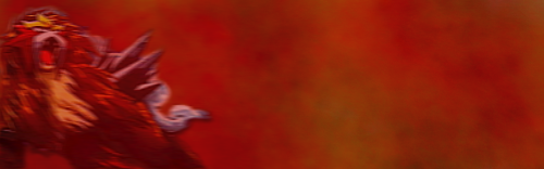
(w/o text) Please comment _________________ ^DarkCosmos, Poems^ |
| Mon Sep 24, 2007 1:18 pm |
|
|
Pokemon Ranger   Joined: Thu Jul 19, 2007 12:09 pm Posts: 954 Location: MN |
I don't mean to sound rude, but your sigs are well, bad. The text almost always seems out of place, and the background never flows with the sig. You always super size renders/sprites as well, making them blurry. Not good. Some are to plain as well.
----------------------------- You've gotten better, but you still have a long way to go. 6.6/10 ((siggies)) ----------------------------- The Ampharos avvy is... ugly. Parts of it seem way out of place. 5/10, because you didn't supersize it. ----------------------------- The Metagroos-Steelix fusion is bad. The right arm seems out of place, and it's obvious that the left-most arm is a Beldum without a head. 2/10 ----------------------------- The sculpture is the only thing that I actually like. 8/10 _________________ An expert at anything was once a beginner.  |
| Mon Sep 24, 2007 1:51 pm |
|
|
Pokemon Master Joined: Tue Jun 19, 2007 11:24 am Posts: 1152 Location: IN THE EMOTIONLESS TRAWLING FERVOR'S OF MY INSANE MIND. |
I can't text well
Here's some more random stuff: 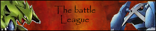
Lotza resizeing 
I know I got the render a bit off center with this one, sorry. 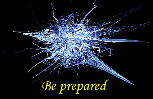
Obviously I didn't do the render, some guy named bash made it, I just added text 
Lol, I know it's bad. The drill doesn't fit and all that but......So fun to make. Dunsparce with darkiri colors. Please comment/gasp in eye pain! _________________ ^DarkCosmos, Poems^ |
| Tue Sep 25, 2007 3:40 pm |
|
|
Pokemon Master Joined: Tue Jun 19, 2007 11:24 am Posts: 1152 Location: IN THE EMOTIONLESS TRAWLING FERVOR'S OF MY INSANE MIND. |
I got a few new brushes and fonts so I made another one to test them out:

Love da smear _________________ ^DarkCosmos, Poems^ |
| Thu Sep 27, 2007 12:16 pm |
|
|
Pokemon Master Joined: Tue Jun 19, 2007 11:24 am Posts: 1152 Location: IN THE EMOTIONLESS TRAWLING FERVOR'S OF MY INSANE MIND. |
No ones giving me comments


 _________________ ^DarkCosmos, Poems^ |
| Sat Sep 29, 2007 12:19 pm |
|
|
Ace Trainer Joined: Mon May 14, 2007 3:43 am Posts: 396 Location: UK |
Awwwww
Night Fears Morning - Inverts look bad... but if they wanted inverts there isn't much else to do... text looks a little blurry and the background is a bit plain Coolest etc. - The outline on the totdile (or is it one of the evolutions Lucario - _________________ Yes, I used to have a shop; no, I'm not still doing it. (Unless you can give me a good reason...) |
| Sun Sep 30, 2007 4:48 am |
|
|
Fails at life  Joined: Sat Sep 29, 2007 10:13 pm Posts: 40 |
Nice gallery, dunsparce!
Your banner is very good. |
| Sun Sep 30, 2007 6:29 am |
|
|
Pokemon Master Joined: Tue Jun 19, 2007 11:24 am Posts: 1152 Location: IN THE EMOTIONLESS TRAWLING FERVOR'S OF MY INSANE MIND. |
Jevi, who ARE you? Which banner?
Yeah the totidle and lucario are a bit sloppy, I was in a hurry. The "sharp" outline is leftovers of the card backround I took it from. For "the night fears" he specifically requested and pure black backround. How come no one's commented on smeargle one? _________________ ^DarkCosmos, Poems^ |
| Sun Sep 30, 2007 6:39 am |
|
|
Pokemon Ranger  Joined: Sat Dec 10, 2005 1:30 pm Posts: 843 Location: Psypoke |
While you're not the worst sig maker I've ever seen, you've got some room for improvement.
Your renders don't fit into the background very well, and the backgrounds on some are pretty sloppy. I could help more if I knew what program you were using. _________________ Get free graphics here... http://obeliskgfx.wordpress.com |
| Sun Sep 30, 2007 9:59 am |
|
|
Pokemon Master Joined: Tue Jun 19, 2007 11:24 am Posts: 1152 Location: IN THE EMOTIONLESS TRAWLING FERVOR'S OF MY INSANE MIND. |
I usey the GIMP.
Of course I'm not the worst :roll: (so sad they got rid of it) P.S. 550th post 0.0 _________________ ^DarkCosmos, Poems^ |
| Sun Sep 30, 2007 10:03 am |
|
|
Pokemon Master  Joined: Thu Jun 15, 2006 4:59 pm Posts: 2399 Location: feel the mambo |
_________________ gone. |
| Sun Sep 30, 2007 11:38 am |
|
|
Pokemon Master Joined: Tue Jun 19, 2007 11:24 am Posts: 1152 Location: IN THE EMOTIONLESS TRAWLING FERVOR'S OF MY INSANE MIND. |
Ahhhhhh! You put purplepink on a mewtow sig?!?!?! AHHHHHH! The manliness is gone!!!! (jk, there's lots of manliness :p)
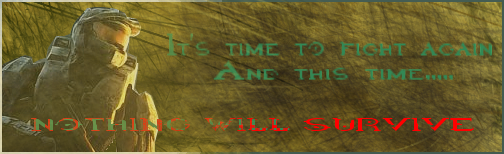
I made a halo sig, it was difficult to text because I KNOW NOTHING ABOUT HALO!!1 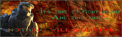
I took the render from a screenshot of the cover. EDIT: Different border: 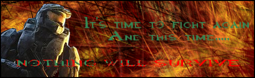 _________________ ^DarkCosmos, Poems^ |
| Mon Oct 01, 2007 2:05 pm |
|
|
Pokemon Ranger Joined: Sat Dec 10, 2005 1:30 pm Posts: 843 Location: Psypoke |
The render doesn't blend in much into the background at all, and the text is a little hard to read.
_________________ Get free graphics here... http://obeliskgfx.wordpress.com |
| Mon Oct 01, 2007 2:41 pm |
|
|
Dragon Tamer  Joined: Sat Jun 02, 2007 7:58 am Posts: 146 Location: Area 23 of Section 2, If you come by an Albino, youve gone to far. |
dunsparce wrote: I got a few new brushes and fonts so I made another one to test them out:
Love da smear I dunno why, or how, or when or whatever, but i actually like that Siggy there. I like the Smearing Backround. 8.9/10 _________________ I have lost interest in Pokemon for good, ive traded in my Diamond and Pearl games and have thrown away the archives, goodbye. |
| Mon Oct 01, 2007 3:07 pm |
|
|
Pokemon Master Joined: Tue Jun 19, 2007 11:24 am Posts: 1152 Location: IN THE EMOTIONLESS TRAWLING FERVOR'S OF MY INSANE MIND. |
Yeah, I like that one too.
Eon: What color's do you think would fit? I can change the background at will (yay for layers EDIT: How's this work? 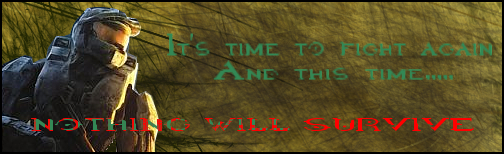 _________________ ^DarkCosmos, Poems^ |
| Mon Oct 01, 2007 3:44 pm |
|
|
Pokemon Ranger Joined: Sat Dec 10, 2005 1:30 pm Posts: 843 Location: Psypoke |
No, you don't have to change the background, just make the render blend in more to the background. Somethings you can do is lightly brush the render the same as the background, use the eraser tool lightly, or change the color balance of the render.
Also, Red is not the best text color choice, nor is the shade of green you used, at least not for that background. Try using Black or White. _________________ Get free graphics here... http://obeliskgfx.wordpress.com |
| Mon Oct 01, 2007 4:21 pm |
|
|
Pokemon Master Joined: Tue Jun 19, 2007 11:24 am Posts: 1152 Location: IN THE EMOTIONLESS TRAWLING FERVOR'S OF MY INSANE MIND. |
I tried black, not good. White isn't good either, so I just tried to blend it in the way you said:
P.S. I'm doing this over and over again because I want to get this one right. _________________ ^DarkCosmos, Poems^ |
| Mon Oct 01, 2007 4:58 pm |
|
|
Pokemon Ranger Joined: Sat Dec 10, 2005 1:30 pm Posts: 843 Location: Psypoke |
Definetly better, but the text is still buggin me.
_________________ Get free graphics here... http://obeliskgfx.wordpress.com |
| Mon Oct 01, 2007 6:10 pm |
|
|
|
Page 5 of 5 |
[ 124 posts ] | Go to page Previous 1, 2, 3, 4, 5 |
|
All times are UTC - 8 hours [ DST ] |
Who is online |
Users browsing this forum: No registered users and 8 guests |
| You cannot post new topics in this forum You cannot reply to topics in this forum You cannot edit your posts in this forum You cannot delete your posts in this forum You cannot post attachments in this forum |