
Forum Index • FAQ • Login
Psybucks • phpBB FAQ • Psypoke Forums FAQ • Forum Rules • Psypoke Staff


 ~
~
|
It is currently Tue Apr 23, 2024 1:23 am |
|
All times are UTC - 8 hours [ DST ] |
Salamence Drawing
Moderators: Mektar, goldenquagsire
|
|
Page 1 of 1 |
[ 10 posts ] |
| Print view | Previous topic | Next topic |
Salamence Drawing
| Author | Message |
|---|---|
|
Pokemon Ranger   Joined: Tue Apr 04, 2006 5:52 am Posts: 558 Location: The United Kingdom. |
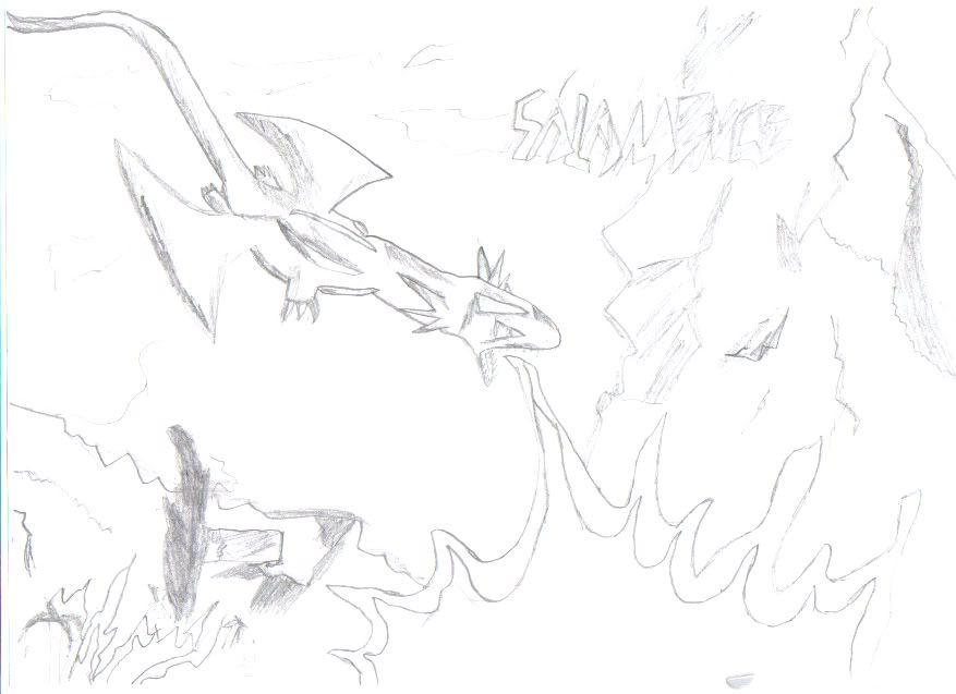
Just wondering what people would think/what I should improve on. The image isn't very well cropped as I tend to lean very lightly with pencils but try and ignore that
http://i191.photobucket.com/albums/z207 ... salam2.jpg *Edit:Uploaded darker version. Last edited by Cal on Wed Jul 18, 2007 10:20 am, edited 4 times in total. |
| Tue Jul 17, 2007 10:35 am |
|
|
Pokemon Trainer   Joined: Wed May 02, 2007 3:07 pm Posts: 40 |
you need to darken the lines, its impossible to tell what it looks like from my computer
|
| Tue Jul 17, 2007 3:52 pm |
|
|
Pokemon Ranger Joined: Tue Apr 04, 2006 5:52 am Posts: 558 Location: The United Kingdom. |
I've uploaded a darker version so hopefully it should be visible from your computer / [size=0]bump[/size]
|
| Wed Jul 18, 2007 10:22 am |
|
|
Bug Catcher   Joined: Sat Jul 07, 2007 9:50 am Posts: 15 Location: Massachusetts, USA |
It looks pretty good! Keep on drawing and try to get even better
_________________    (frostape from st jimmy, other two from well me) |
| Thu Aug 02, 2007 8:59 am |
|
|
Dragon Tamer   Joined: Thu Jun 07, 2007 8:58 am Posts: 102 Location: In a restuarant at the other end of the universe |
yup definitly darken! but nice otherwize
|
| Sun Aug 05, 2007 6:10 am |
|
|
Pokemon Trainer Joined: Thu Jun 07, 2007 2:46 pm Posts: 42 |
id add color it look cool maybe some purple fire
_________________ <img src="http://www.shokimages.com/files/wim4t5njounzmjovzcn1.bmp" border="0" alt="Free Image Hosting"> |
| Mon Aug 06, 2007 9:40 pm |
|
|
Pokemon Ranger Joined: Tue Aug 09, 2005 1:29 pm Posts: 626 Location: ^ Turkey. :D ^ |
Can't you make a SINGLE constructive post Juice Grant? It's rather annoying to see that one person has made the last post on every topic in the forum, and even more so when they're only fourwords long with no grammar.
I think that the drawing is awesome, by the way. _________________ omg turkey used lolbomb |
| Mon Aug 06, 2007 9:45 pm |
|
|
Pokemon Trainer Joined: Sun Jul 22, 2007 5:15 am Posts: 33 |
nice drawing, far batter than i could do... id use a darker pen for one, or just go over it in marker at the end
if you shade it a bit more, then it would be great! |
| Tue Aug 07, 2007 9:07 am |
|
|
Dragon Tamer Joined: Sun Apr 08, 2007 8:07 pm Posts: 122 Location: just imagine it. |
I think you should enlarge the body if the head would be larger than the body but I have to admit it's nice.
_________________ I play Guitar Hero: Aerosmith. Add me and here's my FC: 4597-1845-4478 I play Guitar Hero III: Legends of Rock. Will post my FC later. |
| Thu Aug 16, 2007 7:46 pm |
|
|
Gym Leader   Joined: Wed Aug 31, 2005 4:37 pm Posts: 1906 Location: Some fabulous place |
omg gardy commenting on something.
The body looks very good and well-sculpted. The only problems are the tail looks a bit too long and stringy, and the legs (although it's probably because of the angle) look a bit stubby. The wings are iffy, the wing on Salamence's right looks to be slightly larger and a slightly different shape than its left. The neck looks a bit bulgy, but is still good. The head seems to be a little too long, but is otherwise fine. Also, I think if you are going to re-do this anytime soon, then you should either make the head and neck smaller or the body larger. Overall, I'd give it an eight out of ten, because it's great, but there's a few minor flaws. _________________ GREAT FLAMING EYEBROWS |
| Fri Aug 17, 2007 5:25 am |
|
|
|
Page 1 of 1 |
[ 10 posts ] |
|
All times are UTC - 8 hours [ DST ] |
Who is online |
Users browsing this forum: No registered users and 81 guests |
| You cannot post new topics in this forum You cannot reply to topics in this forum You cannot edit your posts in this forum You cannot delete your posts in this forum You cannot post attachments in this forum |