Here are the rates for Round 2,
RaichuLatias wrote: My rates:
Rayquaza1990:
#5 Golden Dragonair - 3 - I liked the colors of it, it's very pretty with it's Golden colors.
Total - 3
Goldenprince:
#1 Glowing Rival with Santa's Clothes - 4 - The Animation is probably the best part, the fire illusion is a great idea with the Glowing illusion.
#3 Beachball - 4 - It is a simple illusion, but it is very easy to screw up, your's looks perfect.
Total - 8
CyberX:
#1 Emerald Sig - 2 - When I first saw your sig I didn't think much of it, but I noticed you did Shadows of the pokemon and a nice BG, good job.
#4 Jumpluff Animation - 4 - I like this one, it's a little fast, but looks like it took awhile to make.
Total - 6
ShadowFlygon:
#1 Blink'n Glow Umbreon - 8 - You probably knew i'd like this one, The Glowing rings on his body look very well on this one.
#5 Blue Flygon - 2 - Yeah it's cool looking, I like Shades on Blue and Purple on it.
Total - 10
Confused Flareon:
#1 Pichu Banner - 5 - I like this ones BG, it looks well done.
#3 Flareon Sig - 7 - This one looks great with the Pokeball illusion in the corner, I'm guessing it took you a while to make this one.
Total - 12
Skull Kid:
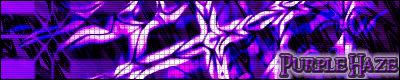
#1 Purple Haze - 5 - I liked the design on how you made the crosses in there, it looks like it took a long time to make.
#5 Sonic Banner - 6 - I liked the writing in the middle and the little squares in the BG, Good Job.
Total - 11
dragonfan#149 wrote: Dum Dum DUM! Round 2
Rayquaza1990
#5-Golden Dragonair(5):The gold and turqouise(sp?) go very well together. Nicely colored too.
Total-5
Goldenprince
#1-Glowing Rival(5):Looks like he could kit some major a**. Nice job.
#3-Volleyball(3):Simple, but I like it.
Total-8
CyberX:
#1-Emerald Sig(4):Love the background, and the shadows.
Total-4
ShadowFlygon:
#1-Glowing Umbeon(6):Glowing is very nicely done.
#5-Glowing Flygon(4):Love the color selection.
Total-10
Confused Flareon:
#1-Pichu Sig(8):Love the background and text. Nice.
Total-8
Skull Kid:
#1-Purple Haze(9):Color, crosses, text all perfect.
#5-Sonic Sig(6):Looks like it took you a while. Love it.
Total-15
Darkkend wrote: Rayquaza1990
#2-Multi-Colored Ho-oh (6): I like the choices of colors you chose for Ho-oh the Purple give it a Royal touch as if your interpurting it has a king, the rest of the recoloring is done pretty tastefully each color kinds of compliments the other.
Total- 6
Goldenprince
#1-Glowing Rival(5):The sprite looks well done, nice touch with increasing the fire with the glow, what i didnt like is that the glowing edges stop at the boardes and is cut off
#3-Volleyball(3):Great idea, only thing that would have made it better would have bin giving the beach ball a little spin.
Total-9
CyberX:
#1-Emerald Sig(4): The individual aspects arent that great, but together it works it and fits with the theme you created.
Total-4
ShadowFlygon:
#2-Trainer Umbreon(3):Simple and the colors are a little dull, but I like how the trainer sends out the PKMN and Returns it and it works with the loop so the animation doesnt look out of place.
#3-CT Player(5): The colors blend nicely and the animation flows nicely aswell
#5-Glowing Flygon(3):I like the way the colors play off each other and compliment one another.
Total-11
Confused Flareon:
#1-Pichu Sig(3):The background and text are nice.
#3-Flareon Sig (4): The Colors work with each other and the good work with the transparency with the pokeball and flareon on the right.
Total-7
Skull Kid:
#3-Bowser Sig(5):Less is more in this one and you can see and apreciate the hard work that went into it, the sharp and focus bowser works well with the wind swept effects and the distant background.
#5-Sonic Sig(8):Clean and sharp, looks very profesional.
Total- 13
Flannery wrote: Too much good artwork. x_X;;
Goldenprince's #1 - 8 pts
Goldenprince's #3 - 5 pts
A lot of good animations. I wish I could've given points out for them all. The Santa looks very cool and I love the Electrode and Chansey playing volleyball. Only criticism is that the Pikachu animation is hard to understand without an explaination. Other than that, your animations are very good.
CyberX's #1 - 5 pts
The Emerald background is very cool, but your banners are a bit plain. Making the pics bigger might help. They shiny Rayquaza looks awesome, but the fire/beam could use some work.
ShadowFlygon's #1 - 8 pts
Points for originality on the Umbreon. Making its markings glow adds a lot. Like with a lot of entries, I wish could give points for them all. Everything else is very impressive.
Confused Flareon's #1 - 6 pts
I like the background and the pics you used for the Pichu sig, but try to make the colors blend more. Most of the colors in your sigs clash too much. Still, you do a good job.
Skull Kid's #1 - 8 pts
Skull Kid's #5 - 10 pts
They're all very well done. The Purple Haze sig blends very well and I wish it were mine (<3's purple). The Sonic/Robotnic one -does- look like it took a long time, and I absolutly love it. Keep up the good work.
Totals
GP - 13 pts
CX - 5 pts
SF - 8 pts
CF - 6 pts
SK - 18 pts
Star wrote: All right. Here are my ratings...
Rayquaza's #5 - 5 points (The recoloring was done nicely. It looks like a shiny gold color. Pretty.)
GP's #3 - 4 points (Yes, it's simple, but it's cute. I find it rather funny as well. If you added some spin to the ball it would look more realistic.)
CyberX's #1 - 4 points (That's not bad at all. The pokemon go well with the backround. The backround is nice, the colors are nice, and the shadows are cool. Rayquaza looks discolored, though.)
SF's #1 - 7 points (Umbreon looks like it's focusing it's power. Cool. The glowing rings are nice.)
SF's #5 - 5 points (Nice recoloration and animation.)
CF's #1 - 5 points (Cute. The backround is colorful and the text is nice.)
CF's #3 - 6 points (The backround goes well with flareon. The ghosted flareon and pokeball look good. Nice job.)
SK's #1 - 6 points (It looks great. The text and the effects are very cool.)
SK's #5 - 8 points (Awesome! Simply awesome! This sig is very well done, indeed. Effort was definitely put into this one.)
*~*Totals*~*
Rayquaza - 5 points
GP - 4 points
CyberX - 4 points
SF - 12 points
CF - 11 points
SK - 14 points
Lots of awesome work this round. Keep up the good work, everyone!
Galar wrote: Rayquaza1990's #5 -- 3 points -- I liked this golden Dragonair. It's just a simple recoloring, but a nice job.
Goldenprince's #3 -- 6 points -- It's simple, but its so funny. I liked it a lot, though I think you could improve it a bit, maybe giving the pok
|