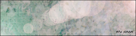
Ok, so I found this awsome tutorial for making sigs by xalia, and I had a go at maknig a sig, and here's what i got. I've made a buch of other stuff I'll post later.

| Psypoke http://www.psypokes.com/forums/ |
|
| ix's art gallery http://www.psypokes.com/forums/viewtopic.php?f=21&t=21457 |
Page 1 of 1 |
| Author: | Inta Xonem [ Sun Feb 03, 2008 3:07 am ] |
| Post subject: | ix's art gallery |
Ok, so I found this awsome tutorial for making sigs by xalia, and I had a go at maknig a sig, and here's what i got. I've made a buch of other stuff I'll post later.
|
|
| Author: | Chronicler [ Sun Feb 03, 2008 10:00 am ] |
| Post subject: | Re: ix's art gallery |
I'm pretty sure galleries consist of more than one piece, but whatever, the banner is pretty cool, good work. |
|
| Author: | Valentine [ Sun Feb 03, 2008 10:21 am ] |
| Post subject: | Re: ix's art gallery |
ew that font is ugly i suggest getting fonts from swimchick.net (jane austen > *) or even dafont before you even try to make an "advanced" sig. :( |
|
| Author: | tennis8668 [ Sun Feb 03, 2008 12:36 pm ] |
| Post subject: | Re: ix's art gallery |
I like what you've got so far, but it needs something more. You have a great background, so now add an image or something. Or just make really big well designed text. There's just so much empty space. |
|
| Author: | Seeker [ Mon Feb 04, 2008 1:49 am ] |
| Post subject: | Re: ix's art gallery |
It is great so far but it is too empty... I'd suggest putting in a light blue pokemon in all that emptiness. And yes, that font IS ugly, I strongly suggest a change But that's just my (A.K.A a nobody's) opinion. Don't worry about it too much. |
|
| Author: | DatVu [ Mon Feb 04, 2008 2:18 pm ] |
| Post subject: | Re: ix's art gallery |
The colors are fine as well as the pattern, and there nothing wrong with a simple signature. You don't have to add an image. I like it, though the text is off-putting. |
|
| Author: | Inta Xonem [ Sat May 03, 2008 7:56 am ] |
| Post subject: | Re: ix's art gallery |
|
blah I was bored. I was too lazy to go find a render for it. I tried a battle revolution image of squirtle but it just looked awful D: I did download a bunch of texts, but they all looked even worse than this. I know, this sucks too, but it suits the sig better than the ones I downloaded. I'm going to try edit it though so the text + border look ok. EDIT: I tried and it looked worse. Oh well |
|
| Author: | dragonite [ Sat May 03, 2008 8:19 am ] |
| Post subject: | Re: ix's art gallery |
If you're going to make a sig without a render, make the text bigger so the sig doesn't look so empty. Also, try a different font, and set the style to 'strong' (if possible) Also, don't be afraid to use default fonts. such as georgia, century gothic, etc. |
|
| Author: | Inta Xonem [ Sun Jun 08, 2008 1:35 am ] |
| Post subject: | Re: ix's art gallery |
Gogo random avatars:     


I really need to get a life D: Most of these I made for an avatar gallery thingy on Pokemon scarlet. Feel free too use them as your avatar. |
|
| Author: | poplers [ Tue Jun 10, 2008 8:14 pm ] |
| Post subject: | Re: ix's art gallery |
why do you have a combee avatar. YOU KNOW COMBEE IS MY FAVORITE >:| anyways, thise are decent looking, the bidoof one is blurry, and they all need to look like you actually did work on them instead of adding a border and cropping it down to 70x70. Just my 2 cents. |
|
| Author: | Inta Xonem [ Wed Jun 11, 2008 12:24 am ] |
| Post subject: | Re: ix's art gallery |
Quote: why do you have a combee avatar. YOU KNOW COMBEE IS MY FAVORITE >:| And you know I like annoying you :p Meh, I changed mine for you. I like Vibrava too But I can't see how I can fix the problem that they look like they had too little work on them (which they did D:). We all know I'm crap at putting text on anything. |
|
| Author: | dragonite [ Wed Jun 11, 2008 8:38 am ] |
| Post subject: | Re: ix's art gallery |
i agree with poplers about the fact that they look like you just cropped them and added a border. maybe try some pixel/bitmap fonts? if you set them to 7 or 8pt, put 'none' for the text style, and add a 1px border/stroke, it looks really nice on small avatars. |
|
| Author: | Patchy [ Wed Jun 11, 2008 2:06 pm ] |
| Post subject: | Re: ix's art gallery |
I (Hope you don't mind!) |
|
| Author: | DragonPhoenix [ Wed Jun 11, 2008 9:00 pm ] |
| Post subject: | Re: ix's art gallery |
sweet as, i'm claiming squirtle |
|
| Author: | Seijutsu [ Thu Jun 12, 2008 1:19 am ] |
| Post subject: | Re: ix's art gallery |
The banner's font is bad, try to use the simple like Impact ( don't make it italic ) The avatars are awesome |
|
| Author: | Inta Xonem [ Thu Jun 12, 2008 10:52 am ] |
| Post subject: | Re: ix's art gallery |
Meh, I let you pressurise me into adding text to one. 
How is it? |
|
| Author: | DNA [ Thu Jun 12, 2008 1:14 pm ] |
| Post subject: | Re: ix's art gallery |
They're just scans of TCG cards, nothing super-special. I crop stuff like that for myself often. (Like what I'm using right now.) That is not to say that they aren't ugly; they actually turned out quite well. Quote: and cropping it down to 70x70. The limit is technically 75x75, but both work well. |
|
| Author: | Seijutsu [ Thu Jun 12, 2008 5:09 pm ] |
| Post subject: | Re: ix's art gallery |
Inta Xonem wrote: Meh, I let you pressurise me into adding text to one.
How is it? If you use Photoshop / GIMP to make Avatar, try to stroke out the text |
|
| Author: | Inta Xonem [ Thu Sep 25, 2008 8:42 am ] |
| Post subject: | Re: ix's art gallery |
*Revives again* Meh, I decided to have a go at revamping again and this is how my attempt worked out. It took me about 40 minutes, because I completely redid all of the shading. 
I'm personally quite pleased with it. It's from Pokemon Yellow, btw. Quote: If you use Photoshop / GIMP to make Avatar, try to stroke out the text I have, and can use up to a point, GIMP, but I do prefer paint. The sigs I made at the top of the page were made using GIMP. |
|
| Page 1 of 1 | All times are UTC - 8 hours [ DST ] |
| Powered by phpBB® Forum Software © phpBB Group http://www.phpbb.com/ |
|