Psypoke
http://www.psypokes.com/forums/

Rate Khris's Art
http://www.psypokes.com/forums/viewtopic.php?f=21&t=20805
Page 1 of 2

Author:  Latios [ Sun Dec 09, 2007 5:29 pm ]
Post subject:  Rate Khris's Art

Yeah I couldn't think of a name, but I've been using photoshop for about a year now. A shop would be too much work so I'll just post some of the art that I make when I'm bored and you guys can rate it.....

Also don't steal my art that's against psypoke rules/regulations. Just ask.

Edit: My first ever sig
Image
Newer version
Image

This mario one I made the other day when I was sick
Image

I usually make alot of kirby sigs so I might as post my favorite.
Image

Death note(I didn't use any brushes).
Image

Author:  Latios [ Tue Dec 11, 2007 7:59 pm ]
Post subject: 

Well here's some more art I finished today.

Zelda
Image

Sonic since I mean he is sega basically
Image

Damsel in distress
Image

Author:  Uchiha Itachi [ Tue Dec 11, 2007 8:05 pm ]
Post subject: 

Those are really good! But you should consider blending your stock into the BG. And some of the text needs some work.

Author:  Drakontas [ Tue Dec 11, 2007 8:22 pm ]
Post subject: 

Cool! Creative names, great work! Did you make it from scratch?

Author:  Latios [ Wed Dec 12, 2007 1:20 pm ]
Post subject: 

Well yeah, the only thing I didn't create are the photo's of course.

I did this pit one last night, I think it's my best work yet.
Image

Some older ones I made about a month ago
Image

Image

Watcha think?

Author:  poke_D-molisher [ Wed Dec 12, 2007 2:52 pm ]
Post subject: 

wooow those look nice man ... keep up tha good works ^^

Author:  Uchiha Itachi [ Wed Dec 12, 2007 5:04 pm ]
Post subject: 

Your Pit one is indeed very good. But the text on the others are a little...well...not very appealing.

Here's some CnC a guy on another forum gave me.
Quote:
Make it simple, pleasent, nice. Not "Oh its linkin park font!" No, thats just..no. I tryed it, it never works with about 100% of the sigs (that dont suck) iv seen. Stick with something like Arial, or Century Gothic. Something Clean and simple, you can always use effects on it.

But if you rather not heed my advice, or you doing a graphic arts project that isnt a sig here is a link for moar fonts; http://www.typenow.net/themed.htm

Author:  gonboo [ Thu Dec 13, 2007 1:58 pm ]
Post subject: 

Latios wrote:
I did this pit one last night, I think it's my best work yet.


While it may look all appealing with the color balance and the render, I think it has lost some flow, comparing to most of your other sigs. I mean, I'll take the Ike one as an example; You can see the background has some depth (one looks at the difference between the proximity of the splattered part and the sharp lower left part at the left of your sig), while in your Pit one, it looks actually more like it's all at the same 'level', layer, call it what you want, but imho, you should brush for depth, not for ultra cool effects, if you know what I mean.

Anyways, they look all cool, but they can get even better. I've got one piece of advise: Try bringing your main render in, Gaussin Blur it (2.0) and then go Edit > Undo Blur. Change the blending mode to Screen and slowly reduce it, to something among 30-50%. You'll notice a little change, which I will let you try it and see for yourself =)

Author:  Latios [ Fri Dec 14, 2007 7:53 am ]
Post subject: 

Well here's some new ones:

I tried to take your advise to heart gonboo and added more depth to the background what do you think?
Image

I was playing around with this one but I think it came out okay
Image

Bleach
Image

Author:  poke_D-molisher [ Fri Dec 14, 2007 8:47 am ]
Post subject: 

WOW WOW WOW

i love that one from sasuke THAT 1 is AWSOme that is by far most the best sig i ever seen :shock: :shock: :shock:

WOW really like .... it looks perfect

Author:  gonboo [ Fri Dec 14, 2007 11:15 am ]
Post subject: 

That's quite an improve, I shall say!

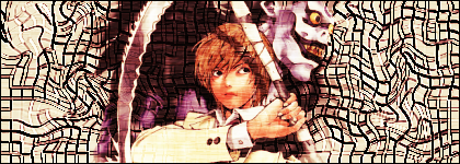
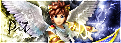
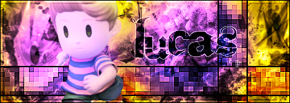
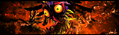
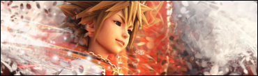
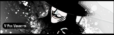
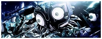
The first sig you made has a pretty good color combination and the render fits well. If only you could blur it a little more... But it's good that way. You've also made a good work on the background but it looks like... well, you've gone a little grounge brushing crazy =P. Try using different types of brushes (e.g. vectors, tech, shapes, whatever else). Don't change the background though; it's actually a pretty good brushing, just doesn't reflect a lot of variety.

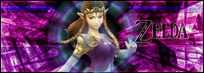
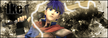
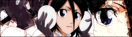
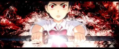
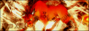
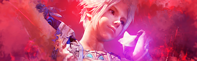
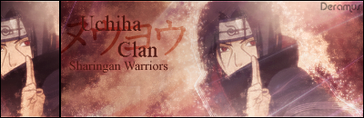
As for diversity, the second sig is better. You have sharp spots here and blurred spots there, it has a good flow, but there's this one thing that's important on most of sigs: a focus point. They're usually relatively easy to add, and it brings more attention to one desired point of yours in the sig, it's easy on the viewer's eyes and it even helps the theme of it.

I'll explain: Let's say you wanna add, taking your current example, Lucas. I don't know much about the Mother series, but I recall he's a good guy, so the theme will most likely reflect a lighter representation. You should stick out the lighter colors in the sig in this case. This can be done very easily: Create a new layer above all the other ones on your work, grab a soft round brush 200-300px and brush white just behind and/or above the render. Maybe at the sides, if it's wielding a weapon, it might aswell work well to focus on the weapon, or in this precise case, maybe the luminosity should come from above his head. In the other hand, most of times, at the same time, you should brush black in places far from the focus. While not many people listen to this, in my opinion, it gives quite a twist to one work, specially if it's one holding a special value/meaning.

Other than that, your sig is really well balanced with the effects. That cross with the squared pattern is pretty original and you should add that touch of your own originality that makes one's work unique everytime you do something. By saying this, I don't mean that you should always add that cross-like thing, but maybe, improvise a little, even if it doesn't seem adequate at first, it brings new levels to the signature and if it helps with other elements (e.g. in this sig, you've managed to make the final S from the text layer Lucas work a lot well with the cross thing, which brought out a nice, eye-easy effect).
I know this might sound off-context, but if you're going into art and do a lot of signatures, you'll gain tendences and something that makes your work stick out of the other artists, which happens naturally, and is, not only appealing, but brings some additional satisfaction everytime you make something, it just feels like, "this is so only mine", hopefully you know what I mean.

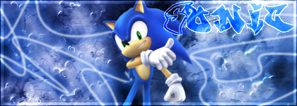
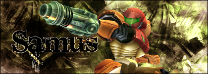
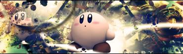
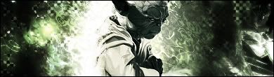
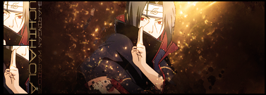
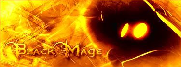
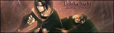
Onto the third sig: As strange as it may seem, you've managed to balance the other earlier aspects I meantioned from the other signatures, lowering their effect, nonetheless blending them.
I can't really give much critique on this one now, I think it's well balanced everywhere, and slightly needs other elements I meantioned before. However, the fact that you didn't (or if you did, I don't really notice) use brushes to make your background on this one really appeals to me, it shows some originality and a will from you to try new stuff around.

And that's how I see it overall. Keep please doing more, I am quite interested in your work as you've been managing to improve constantly, which is not always easy =).

Author:  Latios [ Sat Dec 15, 2007 10:11 am ]
Post subject: 

Okay I did the first two for the first time, I used CS3 for these.
Image

Image

Later both of my photoshop's wouldn't load so I used my sisters computer with GIMP. Long story short GIMP sucks, even when I read the instructional manual it's pretty confusing. Anyways these came out okay.
Image
Image
Image

Hopefully ps will be working later and I can post some ps art.

Author:  Latios [ Sun Dec 16, 2007 5:11 pm ]
Post subject: 

Okay my photoshops are back up.

My favorite Nintendo Character besides Link:
Image

Went a little crazy but it came out okay
Image

Skull Kid
Image

Pervert Sensei
Image

Blood +
Image

Author:  Medichamrulez [ Mon Dec 17, 2007 1:02 pm ]
Post subject: 

WOW! 9.9/10! and the zelda one makes her look hot 8-)

Author:  Latios [ Mon Dec 17, 2007 2:16 pm ]
Post subject: 

Thanks

Here are two more I did today:

Yoda
Image

Sora (I tried to make it look like the background was pulling him in)
Image

Author:  Uchiha Itachi [ Mon Dec 17, 2007 5:25 pm ]
Post subject: 

I'm definitely seeing some improvement. One thing I suggest, again, is spicing up your BG, using brush strokes (preferrably spatter), erasing where bad, then gaussian blur (1.0), erasing where bad, and finally, sharpen, erasing where horrible. As a finishing touch, I add a photo filter and pick whatever matches with whatever I make. (Layer > New Adjustment Layer > Photo Filter > OK > Pick.) Then, if I'm not satisfied, I add a gradient map.

If you don't get any of these terms or need to see an example, just tell me. I tend to not make sense occasionally.

Author:  Latios [ Tue Dec 18, 2007 2:52 pm ]
Post subject: 

Yeah I pretty much understand everything that your saying except erasing is horrible, I'm guessing that means don't erase?

I tried to use your text opinion but it doesn't look right, I'll try again. Yeah my best one yet....

Ta Da Red XIII
Image

Author:  Latios [ Fri Dec 21, 2007 8:37 am ]
Post subject: 

What happens when your bored and experimenting with photoshop.
Image

Again Uchiha Itachi if this isn't where you were going with the text suggestion, I give up.

Author:  Uchiha Itachi [ Fri Dec 21, 2007 2:22 pm ]
Post subject: 

IT'S ITACHI! The blending...'tis wonderful! :lol:, the effects used were very very nice, but the text is...meh... XD... It's sort of hard to pick out a good text. I don't have a huge variety, so I stick with Century Gothic and Times. Here's an example with my text selections.
Image
Century Gothic, strong, bold

Author:  Latios [ Mon Dec 24, 2007 7:17 pm ]
Post subject: 

I decided to make a couple more before Christmas, by the way Happy Holidays.

The same cropping idea I used with the Itachi one.
Image

This comic was badass, too bad there were only like 8 issues, but it has Natalie Portman in the movie from the newer Star Wars movies.
Image

Vaan
Image

Author:  Uchiha Itachi [ Tue Dec 25, 2007 1:24 pm ]
Post subject: 

The one with Gotenks is really good, besides the fact you spelled "Saiyan" like "Sayan". Nice text choice. ;D

Wow, the V for Vendetta one is really good. Good job blending and working with colors/text.

The Vaan one needs quite a bit of work. I'm not sure, it's just not as appealing and, well, *matching* as the other two. Sort of. Also it lacks text. D=

Author:  Latios [ Fri Dec 28, 2007 9:28 am ]
Post subject: 

Uchiha Itachi wrote:
The one with Gotenks is really good, besides the fact you spelled "Saiyan" like "Sayan". Nice text choice. ;D

Yeah I found out it was spelled wrong when my little cousin was playing Tenkaichi(however you spell it).

Here's a Black Mage but I always call them vivi's for some reason
Image

I like this one even though I still haven't played GoW2
Image

Another Skull Kid sig
Image

Author:  Latios [ Tue Jan 01, 2008 1:03 pm ]
Post subject: 

Here's a couple of sigs.

Image

Image

Author:  Latios [ Mon Jan 07, 2008 8:02 pm ]
Post subject: 

I don't know if anyone wants to rate anymore or what but here is another sig.
Image

Author:  bluebell_rose [ Fri Feb 15, 2008 5:40 pm ]
Post subject:  Re: Rate Khris's Art

They look great. I can't make them that good though

Page 1 of 2 All times are UTC - 8 hours [ DST ]
Powered by phpBB® Forum Software © phpBB Group
http://www.phpbb.com/