Psypoke
http://www.psypokes.com/forums/

D's manifistaions ~ 2
http://www.psypokes.com/forums/viewtopic.php?f=21&t=20594
Page 1 of 1

Author:  dunsparce [ Mon Nov 26, 2007 4:31 pm ]
Post subject:  D's manifistaions ~ 2

To avoid necromancy I'm just going to start a new topic, here is my old one (if you want to see my trip through understanding gimp).

To start out GIGANTIC DOWNLOAD, all the stuff I've don since October (pretty much only animations)!

Image
(first animation :P)

Image
(avatar in another forum)

Image
(completely messed up :P)

Image
(Weeeee! Part of my sig in another forum)

Image
(My first try at making a bouncing ball XD)

Image
(avatar made for treekoluv's competition)

Image
(Hello current sig)

Image
(Hello current avy)

Image
(Sig in another forum, don't stare at it too long!)

Image
(ZOMG! I killed the sun :o)

Image
(It just keeps going.....)

Comment please :).

Author:  Jodi [ Wed Nov 28, 2007 7:33 am ]
Post subject: 

Pretty nice matching avatar/signature set. Looks like you've improved a whole lot since your very first animations. :)

Neither Dunsparce animation looks fluid enough- Perhaps for the avatar the eyes could quickly fade to red? The signature needs more fluid transitions, too, but for something that large the filesize would be huge.

I really like having the Gyarados fall out of the sig- very creative, there. :) Nice work!

Author:  dunsparce [ Thu Dec 06, 2007 1:48 pm ]
Post subject: 

I gotz meself a new siggy supporting Dark Cosmos forums.

Image

That's Zero and Gallade in there, the text reads "The blade warriors of DarkCosmos."

Author:  dunsparce [ Fri Dec 07, 2007 8:40 pm ]
Post subject: 

A picture for my fic (in paint and gimp):

Image

Image

Author:  Munchlax911 [ Sat Dec 08, 2007 6:50 am ]
Post subject: 

I stared at the sig you told me not to stare at.... OH GAWD!!!1!!11!!! Lol

Author:  dunsparce [ Mon Dec 10, 2007 11:49 am ]
Post subject: 

Munchlax911 wrote:
I stared at the sig you told me not to stare at.... OH GAWD!!!1!!11!!! Lol


....Ok. Have fun with your seizure :P.

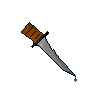
I made another picture for my fan fic. This is completely scratched, shading and all.

Image

More stuff like this is probably going to come soon, I still have the second and first chapter's pictures to do. And considering that I'm planning on making the story 30+ chapters...Yeah. I'm probably going to get good a scratching by the time of done with this :P.

EDIT: Wadda you know? A chapter called "Mythology Class" has a book as a picture.

Image

Author:  poke_D-molisher [ Tue Dec 11, 2007 5:35 am ]
Post subject: 

hmm those are bad... animations man sorry to b harsh but i think yu need a lil bit more practice

Author:  Drakontas [ Tue Dec 11, 2007 8:19 pm ]
Post subject: 

Yeah,but if you keep practicing, you will get good. Then you should start a psybucks store.

Author:  dunsparce [ Thu Dec 13, 2007 10:20 am ]
Post subject: 

Drakontas wrote:
Then you should start a psybucks store.


I did at one point, mostly signatures, I closed it though. I got too busy.

poke_D-molisher wrote:
hmm those are bad... animations man sorry to b harsh but i think yu need a lil bit more practice


Indeed I do...Can you specify what exactly was bad (so I don't make the same mistakes) ?

What about the scratch sprites?

Author:  gonboo [ Thu Dec 13, 2007 1:49 pm ]
Post subject: 

You've got some creative stuff here.

It's just a shame that you're a GIMP user, but one gets used to it eventually.
Overallish, I think your gfx are ok. Like I just said and I feel like pointing it out, you're creative on your stuff (e.g. the picture of your fic), and there's so much more that you could achieve faster and easier by going into photoshop... Yea I know, you're gonna say there's no money to buy it, well it's a shame since it would give you much more possibilities.

Now to rate your gfx: They are indeed creative (xD). I specially like the stuff you did for your fic, but the signatures are also ok, though you should improve. I firmly believe that you should start and get some sense of flow. By saying this, I mean that you should add depth to your signatures, not only placing the elements and let them look like they're floating. You must attach them all together, blend them.

I don't know much about GIMP, but if there is a good paintbrush tool in which you can import paintbrushes, do consider using it. Brush your background, and then blend the elements on it. It'll work pretty well, specially if it's the first time you're using it (then you'll start getting perfectionist and spend hours just making one detail x)).

Keep it up and coming =)

Author:  dunsparce [ Thu Dec 13, 2007 2:47 pm ]
Post subject: 

Well actually it's mainly because I have no motivation to buy it, this is more of a hobby, and gimp works fine.

Is this what you meant?

Image
(I still have to add the text and border)

Author:  gonboo [ Thu Dec 13, 2007 2:52 pm ]
Post subject: 

Yea something close to that. You managed to 'synchronize' the colors but by blending, I don't mean hiding the render under another element. Actually, try something among this:

- Add a render, erase the edges slightly;
- Add a render and background, then bring the render up and put another element on the lower part of the it, overlaping it so it looks like it's coming out from below;
- Set blending modes (if there are any in GIMP?)

EDIT: Oh, don't take my current sig as an example, if you were possibly looking at it. The render behind it is purposedly there, it's not what I mean.
Instead, try looking at this sig and look for yourself, you'll get what I'm saying.

Author:  dunsparce [ Thu Dec 13, 2007 3:40 pm ]
Post subject: 

There's no blending modes I know of for gimp.

I don't have a lot of "elements", but I tried:

Image

How's that?

Author:  gonboo [ Fri Dec 14, 2007 2:37 am ]
Post subject: 

Yea, that's exactly what I mean =) Zero is pretty well blended with its surroundings and Gallade is good too, I'm just not attracted by the fact that the green 'rays of light' go through the flames, but it's alright.

Try doing more if you have time, that's the way to go (in my opinion, don't forget that others might not agree, I'm just advising you in my view).

Author:  dunsparce [ Wed Jan 16, 2008 10:36 am ]
Post subject: 

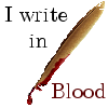
Here I go again...Making another bridge between art and writing.

Image

I resized the pen, added blood, added text and got rid of annoying little white pixels left over. Not all that difficult.

P.S. :twisted:

Author:  poke_D-molisher [ Wed Jan 16, 2008 11:38 am ]
Post subject: 

nice i can c that you have greatly improved sorry for burning you down in the first place... :twisted:

Author:  tennis8668 [ Wed Jan 16, 2008 7:57 pm ]
Post subject: 

Lulz I like the blood pen :O

The most recent sig is brilliantly made (in my humble opinion), especially in comparison to the other ones. More than half of them are just messing around with gimp :P However, the creativity is nice. Keep it up :)


EDIT: Wait Poke_D aren't you b& from psypoke?

Author:  poke_D-molisher [ Thu Jan 17, 2008 4:51 am ]
Post subject: 

yes i where but iam on probation its my last chance here :D

Page 1 of 1 All times are UTC - 8 hours [ DST ]
Powered by phpBB® Forum Software © phpBB Group
http://www.phpbb.com/