Psypoke
http://www.psypokes.com/forums/

Artwork by gonboo
http://www.psypokes.com/forums/viewtopic.php?f=21&t=19624
Page 1 of 2

Author:  gonboo [ Sun Sep 23, 2007 7:53 am ]
Post subject:  Artwork by gonboo

Yup, I'm looking for comments on my work since I am not in this photoshop business for a long time and I'd like to keep improving.

I make sigs...

Image
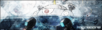
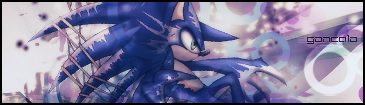
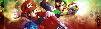
*currently uses this sig*

Image
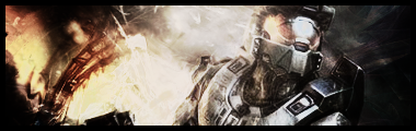
Go Halo >=) (Yea I couldn't find a good font to fit in there x|)
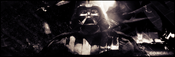
Image
I hate this one...

Image
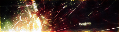
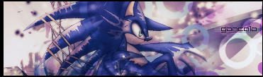
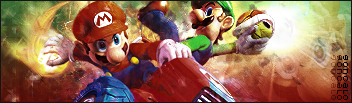
I'm currently using this one in another forum

Image
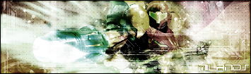
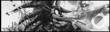
This technique is a lot different from the others

Image
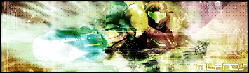
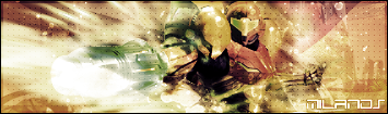
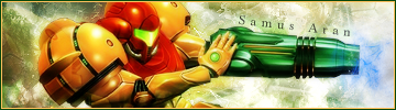
Another Samus signature, again with different techniques

Poke Fusions:

Image

Image

^^ Comments are welcome.

Author:  Sentinel [ Sun Sep 23, 2007 8:11 am ]
Post subject: 

Those are pretty good for just beginning. The Halo one would look better with a different border, though.

It took me a while to find the render in 'shadow lurker', and the Darth Vader one is actually pretty good.

The fusion isn't that good. The parts don't look attached.

On the first sig, you should have done something with the left side of the siggy. It makes the siggy look unbalanced. Other than that, it's pretty good.

Siggies - 8.3/10
Fusion - 6/10

Author:  Eon [ Sun Sep 23, 2007 9:34 am ]
Post subject: 

The sigs are pretty nice. I'd recommend using thinner borders on some of them. It gives the sig a sleeker look.

The fusion needs a little work. It's simply not a good combination. The Seaking head seems way out of place.

Author:  dragonite [ Sun Sep 23, 2007 10:11 am ]
Post subject: 

Niice.

My favorite would have to be your current sig. It just appeals to me ;p

The Halo one seems a bit.. bad-qualitied, maybe thats just me?
I think there might be too much contrast in the shadow lurker, and the render doesn't exactly go with the background very well.

The Darth Vader and Samus Aran ones are nice as well.

Overall, good job on them :]

Author:  gonboo [ Sun Sep 23, 2007 10:56 am ]
Post subject: 

To Sentinel - You're right, the Seaking definitely doesn't fit well. I made a Swagong (swampert+dewgong), and now it looks better.
About the first sig, I tried to stick out the render that maximum I could, so that's why I didn't add much stuff around it.

To Dragonite - The Halo one was half made of a render and half made by me. The render had a really bad quality so I tried changing colors, brightness and stuff so it could look spiffier, and that's the best I could do ^^

Anyways, Psypokes meet Swagong:

Image

=)

Author:  psynvrn [ Mon Sep 24, 2007 1:29 am ]
Post subject: 

That's {swampert}+{dewgong}? That's only a {swampert} with {dewgong}'s tail. Try costumize again that Swagong.

Author:  gonboo [ Mon Sep 24, 2007 11:11 am ]
Post subject: 

I've made my second fusion. I opted not to change too many stuff so I don't mess up stuff.

Finally got it a name: Blamadera

Image

Blaziken, Swampert colors, Gallade leg things and Kingdra's tail.

Author:  gonboo [ Tue Sep 25, 2007 9:29 am ]
Post subject: 

Introducing Croperra:

Image

It's Tropius+Torterra+Cradily

Feedback on these last ones, please?

Author:  gonboo [ Wed Sep 26, 2007 5:35 am ]
Post subject: 

I'm sorry for the triple posts, but I've got something more to show you. It's a signature this time. Another Samus one:

Image

I tried to add some techno look to this one. I also followed your advise, Eon, and added a thinner border. You're right it seems a lot better this way ^^
I didn't leave any clear spaces, just like you said too, Sentinel.

Comments pweash?

Author:  gonboo [ Sat Sep 29, 2007 10:14 am ]
Post subject: 

I've got some new stuff. I need you psypokers to comment though as I've got quite a bunch of techniques and I need feedback to know what signature are best so I can improve.

Image
My first pokemon signature ^^

Image
A signature for a friend

Image
This one is kinda abstract, and it's for a friend once again

Author:  dunsparce [ Sat Sep 29, 2007 10:20 am ]
Post subject: 

gonboo wrote:
Image


ZOMG!!! Tis weird. Abit more brightness on the right side would be good for it.

The samus one.....Hurts my eyes, a bit too many colors in there dude.

The magnezone's pretty good, kinda cluttered but good.

I like the croperra, seems to blend together pretty well. Though the head does seem kinda weird for some reason.....

Author:  gonboo [ Sat Sep 29, 2007 10:34 am ]
Post subject: 

I don't have the PSD for the abstract one anymore so I won't be able to move stuff and mess with the lightness, sorry.

I could saturate the samus one though. I think I prefer color sigs, but here's the one saturated:

Image

Author:  dunsparce [ Sat Sep 29, 2007 10:38 am ]
Post subject: 

It's a bit better but I really meant there was too many hues. It seemed that you just lowered the brightness. I liked this one Image
the most of the samus ones.

Author:  gonboo [ Sat Sep 29, 2007 10:48 am ]
Post subject: 

Image

Less hues. Better?

Author:  dunsparce [ Sat Sep 29, 2007 11:10 am ]
Post subject: 

Yup, better.

Author:  gonboo [ Sun Sep 30, 2007 8:12 am ]
Post subject: 

Just finished making 2 versions of a new sig with my username of another forums.

Normal version
Image

BW version
Image

Thoughts please.

Author:  dunsparce [ Sun Sep 30, 2007 9:02 am ]
Post subject: 

Normal version the beastness, except for the left edge of the bordorbeing too large. Good job.

Author:  gonboo [ Sun Sep 30, 2007 9:20 am ]
Post subject: 

I thought the signature would fit nicely with that kind of border, but I'll follow your advice:

Image

Author:  dunsparce [ Sun Sep 30, 2007 9:41 am ]
Post subject: 

Now it's slighty too thin XD. If you like it though don't change it just because of me, I just like even borders.

Author:  gonboo [ Mon Oct 01, 2007 12:00 pm ]
Post subject: 

(double-post mistake, check next page for the actual sig)

Author:  gonboo [ Mon Oct 01, 2007 12:03 pm ]
Post subject: 

Image

=)

Author:  dunsparce [ Mon Oct 01, 2007 1:28 pm ]
Post subject: 

Very good job one these but um, are they both the same sig? They look pretty simeler. If they're not then I like the 2nd one better, not sure why......However, I'm not sure about the purpose of the line on the left :?. It doesn't make it look better....

Author:  gonboo [ Mon Oct 01, 2007 1:37 pm ]
Post subject: 

Actually they're exactly the same, it's just, my net is slow like hell and I must've double clicked or something >.< sorry.
And here's the non-line-on-the-left version =P

Image

The line was just some improvize I just felt like doin it x)

Author:  pokemon_otaku [ Mon Oct 01, 2007 1:55 pm ]
Post subject: 

Nice sigs. I like that weird Sonic one. 9/10 overall.

Author:  Pearlman15 [ Mon Oct 01, 2007 3:12 pm ]
Post subject: 

Whoa, youre really really good. 9.1/10 I really like the Mario/Luigi one, and the Magnezone one would be better without that Sprite on the side.

Page 1 of 2 All times are UTC - 8 hours [ DST ]
Powered by phpBB® Forum Software © phpBB Group
http://www.phpbb.com/