Psypoke http://www.psypokes.com/forums/ |
|
Liger_Zero's Stuffz - New Style http://www.psypokes.com/forums/viewtopic.php?f=21&t=16793 |
Page 1 of 5 |
Author: | poplers [ Fri Jun 22, 2007 9:42 pm ] |
Post subject: | Liger_Zero's Stuffz - New Style |
Hello! I've decided to open a gallery. I'm not that good, but I hope to learn more , I've followed some basic tutorials and came up with these three. 
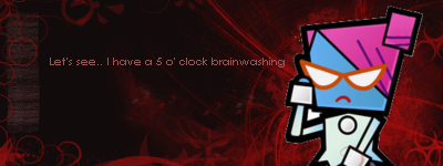
Signature 1: Used basic brushes and was bored when I did this. 
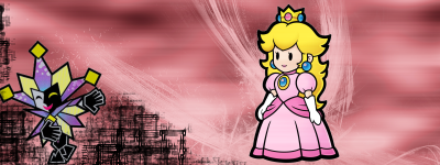
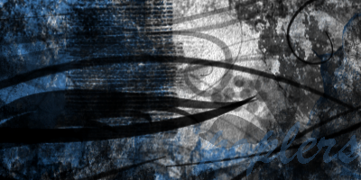
Signature 2:I like the movement from the left to the right, but somethings off. 
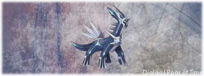
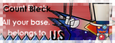
Signature 3: My favorite so far, the text in the bottom was tough to come up with I used some downloaded brushes. Comment please, do I actually have any potential? If not, please tell me! Thanks! |
Author: | embryonicdragonite [ Sat Jun 23, 2007 6:40 am ] |
Post subject: | |
wow cool... the last one is the best though (my opinion) |
Author: | poplers [ Sat Jun 23, 2007 7:22 am ] |
Post subject: | |
The only problem I have with it is the border, I don't know how to make that transparent. Any suggestions, its fading into white at the moment, but I want it to blend with the background behind it. |
Author: | poplers [ Sat Jun 23, 2007 4:12 pm ] |
Post subject: | |
Here's a couple more Signature 4: Reminds me of signature 2.. Same colors and brushes.. Signature 5: My favorite so far! Comments, feedback, ratings..? |
Author: | AkAiR0_MaRA [ Mon Jun 25, 2007 11:39 am ] |
Post subject: | |
i like the first signature best you probably could put a dark pkmn there or sumthin' |
Author: | Blazikendude [ Mon Jun 25, 2007 11:46 am ] |
Post subject: | |
Yay! Nastasia sig! I have a Bleck sig on another site and Treckoluv has a Dimentio one! Anyways, thiier quite good but, their a little plain. The Nastasia one is the best. |
Author: | poplers [ Wed Jun 27, 2007 9:41 pm ] |
Post subject: | |
Here's a couple with Dimentio in them, I like the 1st one more due to the fact that it actually has text. Second one: Comment s'il vous plait. |
Author: | Blazikendude [ Thu Jun 28, 2007 9:12 am ] |
Post subject: | |
The first one seems a little empty, perharps bigger text would work? Until your new sigs, Ciao! |
Author: | poplers [ Wed Jul 11, 2007 4:45 pm ] |
Post subject: | |
Better? I still need more text. =[ |
Author: | Tragar [ Wed Jul 11, 2007 4:58 pm ] |
Post subject: | |
Do you think you can do one of Chunky or whoever he is...the first boss in the Super Paper Mario game? BTW 8/10 because I love SPM! |
Author: | poplers [ Wed Jul 11, 2007 7:08 pm ] |
Post subject: | |
Probably, what text do you want? I'm drawing a blank here. :/ |
Author: | Tragar [ Wed Jul 11, 2007 7:12 pm ] |
Post subject: | |
Lol..something silly like 'Chunky....Stupid but Strong!" I'm going to love it, even if it is bad or not...Because with that text...it'll hilarious! |
Author: | poplers [ Wed Jul 11, 2007 7:46 pm ] |
Post subject: | |
Code: http://i75.photobucket.com/albums/i312/poplers/Signatures/Ochunks1.png How's that? Not necessarily gonna make you laugh, but meh. It still works. |
Author: | Tragar [ Thu Jul 12, 2007 5:42 am ] |
Post subject: | |
OMG YES! That is awesome! I am terrible at signatures...I tried to do one before, but it failed miserably..... |
Author: | poplers [ Thu Jul 12, 2007 6:44 am ] |
Post subject: | |
Hehe, that's the only thing I'm good at. I can't do any fusions or recolors. Your guide did help somewhat, though. |
Author: | Tragar [ Thu Jul 12, 2007 7:20 am ] |
Post subject: | |
I took me maybe 2 hours to make it, because I had to remake the ones I already made...How about....Lord Bleck with the text 'All your base belongs to us!' Another funny one! He kind of reminds of the dude who says that..so yea.. |
Author: | poplers [ Thu Jul 12, 2007 9:31 am ] |
Post subject: | |
How's that? Code: http://i75.photobucket.com/albums/i312/poplers/Signatures/Countbleck1.png |
Author: | Tragar [ Thu Jul 12, 2007 9:38 am ] |
Post subject: | |
Perfect! *Saves to computer to use in..1 week...* |
Author: | poplers [ Thu Jul 12, 2007 3:52 pm ] |
Post subject: | |
I like that one. One of my faves. Comment, rate, do whatever.. here's the code: Code: http://i75.photobucket.com/albums/i312/poplers/Signatures/pip-prin1.png myahh! :/ |
Author: | Pikapal642 [ Thu Jul 12, 2007 10:05 pm ] |
Post subject: | |
Boy, you're really good! I love all of them! I want to try and make that last Piplup and Prinplup one. I also liked the Dialga one. Can you make a tutorial on the Piplup one? It's awesome! |
Author: | Tragar [ Mon Jul 16, 2007 6:45 am ] |
Post subject: | |
Yea...do you think you can make a new one? I want one with O'Chunks as O'Cabbage and with text that says "Oh no! It's O'Cabbage!" I love O'Chunks... |
Author: | poplers [ Tue Jul 24, 2007 9:58 am ] |
Post subject: | |
After ignoring all your requests I decided to do a Swampert colored Jirachi. My first (and hopefully not last) recolor. :O! Edit: I made a celebi body colored/albino Jirachi too! (I Jirachi. ) Double Edit: :O! Blissey Colored Jirachi Celebi colored Swampert :O! Rate please. Triple EDIT!! :O! :O! A gardevoir jirachi! And a Jirachi Gardevoir!:) |
Author: | poplers [ Tue Jul 24, 2007 7:03 pm ] |
Post subject: | |
Here's a couple more, a Cresselia colored bellosom, and a Jirachi colored gallade..also, a kirlia, in guess what, Jirachi colors :O:O:O! I think they look more electric, well, sans the bellosom. |
Author: | Dark Scyther127 [ Tue Jul 24, 2007 7:42 pm ] |
Post subject: | |
the swampert looks a bit odd, but everything is is looking good. is the swampert like that due to the amount of shades Celibi has? |
Author: | poplers [ Tue Jul 24, 2007 8:28 pm ] |
Post subject: | |
Yeah, celebi = too many shades of green. >:O |
Page 1 of 5 | All times are UTC - 8 hours [ DST ] |
Powered by phpBB® Forum Software © phpBB Group http://www.phpbb.com/ |