
Forum Index • FAQ • Login
Psybucks • phpBB FAQ • Psypoke Forums FAQ • Forum Rules • Psypoke Staff


 ~
~
|
It is currently Mon Apr 22, 2024 7:06 pm |
|
All times are UTC - 8 hours [ DST ] |
Dragon Picture
Moderators: Mektar, goldenquagsire
|
|
Page 1 of 1 |
[ 15 posts ] |
| Print view | Previous topic | Next topic |
Dragon Picture
Dragon Picture
| Author | Message |
|---|---|
|
Pokemon Trainer   Joined: Thu Jul 20, 2006 1:36 pm Posts: 48 Location: Why should I tell you? Eh? |
This is my attempt to try and get back into drawing. Hope you like it!
Comments please. 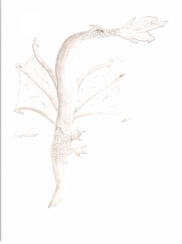 _________________   |
| Mon Oct 16, 2006 9:30 am |
|
|
Pokemon Ranger   Joined: Mon Jul 17, 2006 12:43 pm Posts: 522 |
I gave it a seven, even though you could ahve gotten a 9 or something because it is too light. I can barely see it. But nevertheless, I gave it a 7 because its got some potential.
_________________ <center>  Join PokeJourney, an RPG site, today!  </center> </center> |
| Tue Oct 17, 2006 4:21 am |
|
|
Pokemon Master   Joined: Mon Mar 28, 2005 5:12 am Posts: 1738 Location: England, with the greasy fry ups. |
7/10
What let it down is the fact that I can barely see the right of it. Is that because the scanner is too bright ro you drew too lightly and didnt go over? From what I can see, it has potential, a nice little dragon picture. Fire could use a bit more work though. I like the wings the most. Well done. _________________ Coca Cola, 2 Litres a day, keep ma batteries onnnn. |
| Tue Oct 17, 2006 7:59 am |
|
|
Pokemon Ranger  Joined: Sun May 07, 2006 2:33 pm Posts: 716 Location: USA EST |
It looks like it's supposed to be a western dragon. So, with that in mind, the stomache area should be larger, the tail longer, and there should be fore-arms. There may be in your image but I can't see them, like the others said your image is very light.
Don't be afraid of using a reference! I just quickly found a site you could use. [link] And google images has TONS of images you could reference if you searched 'western dragons'. Same for eastern dragons, there are loads of images and sites. _________________ Link changed to my library. |
| Tue Oct 17, 2006 12:31 pm |
|
|
Pokemon Trainer Joined: Thu Jul 20, 2006 1:36 pm Posts: 48 Location: Why should I tell you? Eh? |
Thankyou very much for the opinions.
To Crimson: It is not a Western Dragon but it came of the top of my head but I may do a picture of a Western Dragon sometime. To everyone: I know it is very light. It is not how I drew but scanners always seem to make things seem too bright (seems obvious as they use a flash or something in the scanning process) Please keep the opinions coming Thankyou SP _________________ |
| Tue Oct 17, 2006 12:47 pm |
|
|
Bug Catcher  Joined: Mon Aug 14, 2006 1:41 pm Posts: 11 Location: Somewhere in Cyber Space |
I gave it a one but I was trying to give it a zero.
How should I put this.....It sucks the big one. Your body is to small for its wings It has only legs and it head is very small. I also think the fire needs work. I would also like to say 40 also give it a one. ... ... ... I really wanted to say zero. It upsets me that its so ugly. |
| Thu Oct 19, 2006 8:01 pm |
|
|
Ace Trainer  Joined: Thu Sep 29, 2005 6:32 pm Posts: 483 Location: Ontario, Canada |
Being a little harsh aren't you NetBattler93?
Anyway, I gave it a 7/10. It was a little light and it's wings need to be a little seperated. But thats a very good job! |
| Fri Oct 20, 2006 12:46 pm |
|
|
Pokemon Ranger Joined: Sun May 07, 2006 2:33 pm Posts: 716 Location: USA EST |
*sigh* I seem to be sighing a lot lately. It makes me sad to see so many harsh comments lately. For those who are critiquing so harshly, and rudely, I would love to see your drawings.
There are few people on this site who actually post drawings, and many of them have been praised even though there are obvious mistakes. Now, Pichu has said that they are trying to get back into drawing. While I can agree that I have seen better we all must realize that we all have. And without using a reference I think this is fairly good. I believe there is a lot of room for improvement, and that Pichu's skill will improve greatly if they continue to practice. There's critisism, and then there's a blatant put down. Many on this site already know I will put people down if I feel they deserve it. And it's usually because of their actions. So, for those giving harsh reviews realize you are entitled to your opinion, but if you wish to say something is bad realize you may be expecting too much. And that if you see issues you should offer advice on how to improve so the issue is removed. No this does not mean you should be unnecessarily nice because a person will never get anything out of that. Be fair in your judgement, and leave room for variables when you decide to rate things. _________________ Link changed to my library. |
| Fri Oct 20, 2006 12:47 pm |
|
|
Pokemon Ranger  Joined: Sat Apr 09, 2005 1:56 am Posts: 657 |
NetBattler93 wrote: I gave it a one but I was trying to give it a zero.
How should I put this.....It sucks the big one. Your body is to small for its wings It has only legs and it head is very small. I also think the fire needs work. I would also like to say 40 also give it a one. ... ... ... I really wanted to say zero. It upsets me that its so ugly. *snorts* Newbies can be REAL STUPID. I suppose the you *snorts again* could do better? Please, be truthful, but don't be rude. Anyway, i gave it a 8. Even though it's WAY too light, there's something 'bout it that i really like, i just can't place my finger on what... |
| Fri Oct 20, 2006 10:15 pm |
|
|
Pokemon Ranger Joined: Mon Jul 17, 2006 12:43 pm Posts: 522 |
NetBattler93 wrote: I gave it a one but I was trying to give it a zero.
How should I put this.....It sucks the big one. Your body is to small for its wings It has only legs and it head is very small. I also think the fire needs work. I would also like to say 40 also give it a one. ... ... ... I really wanted to say zero. It upsets me that its so ugly. like everyone has said before, lay off. that is such a noob. But, I finally figured out what I really, really like about it. I like the head. Even if you can't see it. I can see the shape of it and it looks awesome! Just keep practicing and show us more!!! _________________ <center> Join PokeJourney, an RPG site, today! </center> |
| Sat Oct 21, 2006 3:45 am |
|
|
Fails at life  Joined: Sat Oct 21, 2006 6:52 am Posts: 97 Location: weeping |
i like your banner shiney pichu
 |
| Sun Oct 22, 2006 8:55 am |
|
|
PROBATION  Joined: Wed Aug 16, 2006 7:28 am Posts: 162 Location: In the endless abyss.. |
Ok but next time right someting about the topic. 10/10. I hate when scanners make things lighter on computer. Expelar,as it sais by the tail,is very well drawn. 2 ,if i had more i wouls put them all up, thumbs up!
|
| Sun Oct 22, 2006 9:34 am |
|
|
Ace Trainer  Joined: Thu Jul 20, 2006 9:45 am Posts: 429 Location: Over the rainbow |
7/10 heck its better than my drawings. Great job
_________________ I am so bored so I am erasing your signature. |
| Sun Oct 22, 2006 9:36 am |
|
|
PROBATION Joined: Wed Aug 16, 2006 7:28 am Posts: 162 Location: In the endless abyss.. |
Why are the majority people saying 1 on the polls.
|
| Sun Oct 22, 2006 9:42 am |
|
|
Bug Catcher  Joined: Sun Oct 22, 2006 8:01 pm Posts: 5 |
the wings and arms need to be put a bit more up...but its kool..too light...but id still give it a 7/10...people dont need to be so harsh..i dont see any of them putting there work in here so dnt wry bout it
_________________  |
| Tue Oct 24, 2006 7:52 pm |
|


|
|
Page 1 of 1 |
[ 15 posts ] |
|
All times are UTC - 8 hours [ DST ] |
Who is online |
Users browsing this forum: No registered users and 19 guests |
| You cannot post new topics in this forum You cannot reply to topics in this forum You cannot edit your posts in this forum You cannot delete your posts in this forum You cannot post attachments in this forum |